Gimp 2.8 has been out for a couple of days and I had the chance to use it a little bit. Everybody in the scene seems to be awestruck by the single window mode and I approve, it is sweet. But there are a couple of new features that seem to be in dire need of improvement. Here's are my top three Gimp 2.8 issues:
- Top Gripe: the combo slider/text input fields
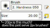
They seem to be designed for the digital painter who swooshes his 50-something pixel brush on his Wacom Cintiq. Also, they require that you pay full attention to where you click when wanting to drag or type.
I often happened to hit the text area when wanting to drag the slider, or to engage the fine scroll mode instead of the absolute point click. This also applies to the layer opacity control, where this fancy combined textbox/slider appears to be total overkill. The precision drag mode is utterly useless since opacity is measured with single decimal precision.
A better brush size control would provide more finesse at the smaller levels and gradually increase the progression by which the brush upscales.
- Second best: the rotation guides
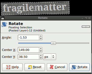
What's the issue with grid lines that are supposed to help you estimate the rotation? You can't see what's behind them properly, so they actually get in the way when you try to align the rotated element to another part of the image.
I rated this second best because you can turn the guides off or choose other options. Unfortunately, the setting isn't remembered so, every time you want to rotate some random bunch of pixels, you will need to reset the thing.
- Last, but not least: the new text control
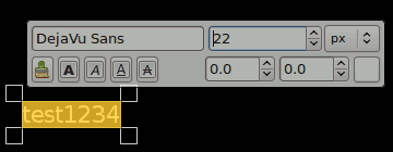
The text layer features introduced with Gimp 2.8 are great, individual letters can be sized, colored or assigned a different font. But in the process of adding these functions other conveniences were rendered less accessible. For instance, moving a text layer around while you are editing it now requires that the user keeps the Ctrl and Alt keys pressed while dragging the text layer. Usually, such shortcuts were displayed in the status bar, but this doesn't seem to be the case anymore.
Another text layer gripe is related to resizing text. To be able to resize the whole content of a layer you will need to select it, pretty much like you would to in a text editor. Doing so highlights the text and, obviously, obscures the background, making it harder to see how your word art fits over the background.
One possible resolution to this would be to have the Tool Options alter the entire text layer and to use the hovering dialog for fine control.
Most of these issues will probably be fixed by the time the next revision comes out and we should keep in mind that the old interface had over 15 years of development behind it. Personally, I'm looking forward to the full Gegl transition that is in store for us Gimp users.